Most of my work for the last ten years has been in consulting of one form or another. The nature of the work involves a lot of communication which all lead to writing reports and presenting material.
Here are some notes on report elements that work for me.
What do we want in a report?
Accessibility The report has to be accessible to a wide audience. In my case that usually means making it relevant beyond the technical elements of the report subject.
Relevance It should be clear why the report has been created, what the report is addressing, what the outcomes are and what the options for actions are.
Clarity The report should be organised in a hierarchical structure, following the Pyramid Principle approach with scope, outcomes and next steps or top level recommendations up front.
Some initial guidance
No obvious templating If the report feels like boilerplate it probably is. The report has to match an ask and off-the-shelf templates rarely answer relevant questions.
No stock photos These are never relevant and indicate that the report has not been tailored. Reports that contain stock imagery go straight into the trash.
Boilerplate, stock photos and other off-the-shelf elements are defining features of reports that have been cranked out by well-oiled, efficient processes put in place at high-volume consulting firms.
Checklist
Consistent styling
If you are doing this for the first time, the following steps might seem tedious, time-consuming and unnecessary. If this is not your first rodeo, these steps will make the report more readable, more consistent and easier to check for consistency. A table of contents should be automatically generated from the proper use of headers.
If you are generating from markdown, you can use,
# Header level 1
## Header level 2
### Header level 3
Pick a font and set the sizes for text at each level (e.g. h1, h2, h3, regular text, footnote, etc).
Headers, layout, fonts
Font sizing
Visual elements
I cannot overstate the importance of visual communication. Properly done, visual communication,
- Removes ambiguity
- Removes places for a lack of clarity to hide
A foundation in order to achieve this,
- Use consistent colours
- Use the same fonts you have chosen for regular text
- Create each visual element from scratch
- Use labels and identifiers consistently
- Use the same visual language throughout the report
Colour selection
Pick matching palletes for different scenarios

- Using the same foundation
- You should be able to mix and match them
Composition

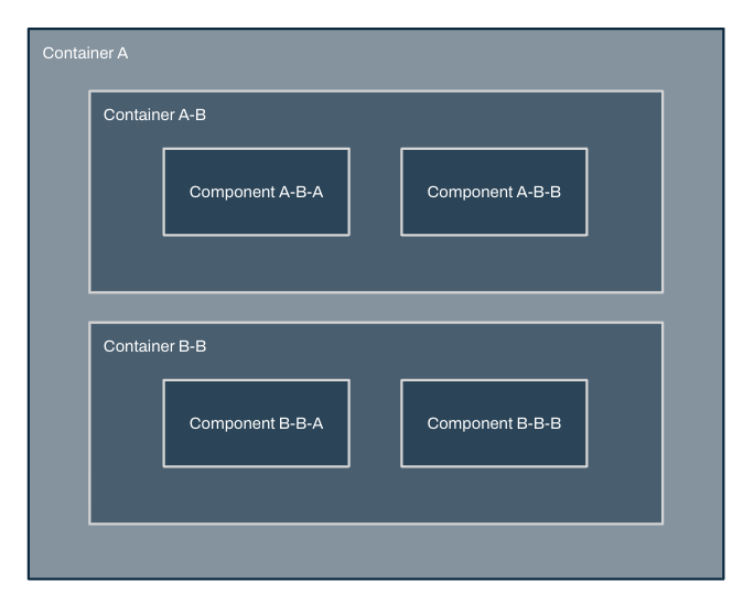
- Container nesting should follow a MECE breakdown
Contrast
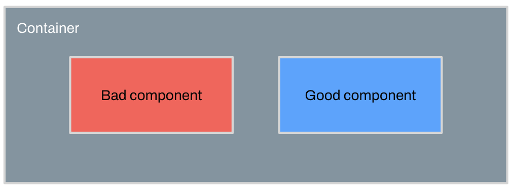
Good / Bad

- Gradient (White/Red) for heatmaps
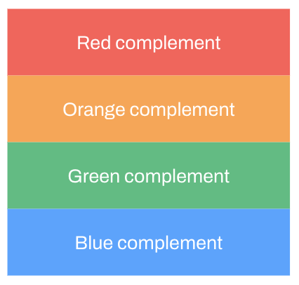
Multiple categories

Imagery
Icons
Icons are useful for providing visual guides. Pick an appropriately licensed SVG based set.
Starting points,
Cover image
I mentioned not using stock photos earlier. I make an exception for the cover. This will often show up in thumbnails of the document, so pick something distinct but clean and inoffensive. Again, also appropriately licensed.
Starting points,